Before going I had analyzed the colors and how they were spread along the color wheel. Once there I also looked at the combination below. This one was one I liked too.

When taking into account that the intensity of the colors varies, I come up with this palette.
The blue in the picture on the right is a bit too intense and the one below too dull... something in between.
But I kind of like the idea of rich, burnt orange with violet/purple and aqua green. I have to seen the right aqua green paint chip.
Once I look through my stash, I will know more.
Or I will go back and look at my other options.
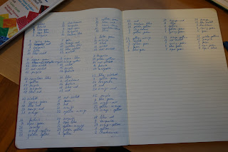
I have written out 24 different variations.


No comments:
Post a Comment